To perform full-screen layout, everything needs to become absolute-position blocks. In addition, it is best to use proportional
height settings so that all the blocks can fill up the screen completely. Listing 7 is the HTML code for full-screen layout
formatting.
1<!
DOCTYPE HTML PUBLIC ”
−//W3C/DTD_HTML_4.01//EN”
2 ”http://www.w3.org/TR/html4/strict.dtd”
> 3<html lang=”en”
> 4 <head> 5 <title>An illustration of CSS
−based Layout
</
title> 6 <style type=”text/css”
> 7 div.slotA
{ 8 position: absolute;
9 height: 20%;
10 left:0;
11 overflow: auto;
12 width: 100%;
13 top:0;
14 background: red;
15 } 16 div.slotA1
{ 17 position: absolute;
18 height: 60%;
19 left:0;
20 overflow: auto;
21 width: 100%;
22 top: 20%;
23 background: green;
24 } 25 div.slotA1
> div.slotB
{ 26 position: absolute;
27 width: 20%;
28 background: yellow;
29 } 30 div.slotA1
> div.slotC
{ 31 position: absolute;
32 left: 20%;
33 width: 80%;
34 background: gray;
35 } 36 div.slotD
{ 37 position: absolute;
38 width: 100%;
39 height: 20%;
40 top: 80%;
41 left:0;
42 background: purple;
43 } 44 </
style> 45 </
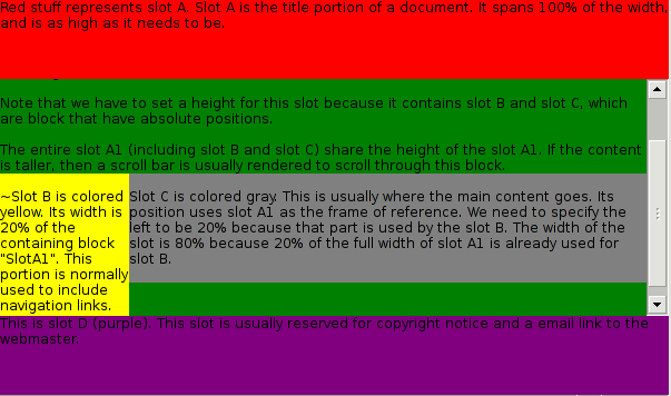
head> 46 <body> 47 <div class=slotA
> 48 Red stuff represents slot A. Slot A is the title portion of a document.
49 It spans 100% of the width, and is as high as it needs to be.
50 </
div> 51 <div class=slotA1
> 52 <p>What is this green stuff? This is slot A1. Slot A1 includes
53 slot B and slot C.
54 However, this portion does not belong to either one. Slot A1 includes
55 both the main content and a left bar for navigation links.
</
p> 56 57 <p>Note that we have to set a height for this slot because it contains
58 slot B and slot C, which are block that have absolute positions.
</
p> 59 60 <p>The entire slot A1 (including slot B and slot C) share the height
61 of the slot A1. If the content is taller, then a scroll bar is usually
62 rendered to scroll through this block.
</
p> 63 <div class=slotB
> 64 <p>˜Slot B is colored yellow. Its width is 20% of the containing
65 block ”SlotA1”.
66 This portion is normally used to include navigation links.
</
p> 67 </
div> 68 <div class=slotC
> 69 <p>Slot C is colored gray. This is usually where the main content goes.
70 Its
71 position uses slot A1 as the frame of reference. We need to specify
72 the left to be 20% because that part is used by the slot B.
73 The width of the slot is 80% because 20% of the full width of
74 slot A1 is already used for slot B.
</
p> 75 </
div> 76 </
div> 77 <div class=slotD
> 78 This is slot D (purple). This slot is usually reserved for copyright
79 notice and a email link to the webmaster.
80 </
div> 81 <body> 82</
html>
The interesting part of this layout is that if you resize the browser window, all the blocks are resized to maintain their
ratios.